Case study · Product design
ThermAtlas
A discovery and review app for sauna and cold plunge facilities, built around the exact criteria enthusiasts use to choose where they sweat and chill.
Role
Design + full-stack build
Type
Directory web app
Focus
Discovery & reviews
Status
Live

The problem
Regulars choose saunas and cold plunges on cleanliness, heat, and vibe, and no map or listing surfaces any of it. I was one of those regulars.
What I did
Interviewed eight practitioners and turned their criteria into the product's filters, designed and tested the interface with five more, then built and launched it myself: Supabase backend, dedupe pipeline, security pass, SEO, metro-by-metro rollout.
What came of it
A live directory of 276 facilities across 11 metros, with reviews and check-ins, and about thirty shipped iterations in the first month.
The context
Sauna plus cold plunge equals thermaculture.
Thermaculture is simple to describe and addictive to practice. You arrive at a facility with a hot sauna and one or more cold plunge tubs, then alternate between sweating and freezing. Body and mind both feel it.
Over the last few years, sauna and cold plunge studios have opened all over the country as part of a broader wellness wave. Each one is different: amenities, the heating method, the quality of the plunge, and the atmosphere all vary. Every facility ends up with its own vibe and culture, which is exactly what makes choosing between them hard.
Why this one is personal
I built the thing I kept wishing existed.
I'm not a neutral observer here. I'm one of the eight.
I've stood dripping in a parking lot in a town I was passing through, phone out, trying to work out whether the sauna down the road runs hot enough to be worth the detour, and come up with nothing useful. ThermAtlas started as my own itch: the tool I wanted every time I traveled, and every time a friend asked me where they should go.
So the research that follows wasn't fieldwork on strangers. It was me sitting down with my own tribe and asking them to say out loud what we all already weigh in our heads. And the obsessive data work later on wasn't box-ticking. It was a regular refusing to let his own directory lie to the next person standing in that parking lot.
The problem
Finding the right facility is not straightforward. Enthusiasts have particular criteria they weigh, and the typical discovery tools (a quick map search, a generic listing) rarely surface that information. People were making decisions with the wrong data, or no data at all.
Research
I went straight to the regulars.
I sat down with eight fellow regulars to understand, from the inside, how they search for and commit to a facility.
I focused on which factors of a facility matter most to them, and how those factors show up at the moment they decide to pay and book a session.
What I learned
Two themes ran through every interview.
One was about what makes a facility worth it. The other was about how people even find one. Both pointed at the same gap.
The strategy
Generic tools bury the things that settle the decision. ThermAtlas does the opposite. A regular should be able to judge a facility the way they judge it in conversation, at a glance, so the criteria people named in interviews became the literal spine of the interface. Every screen and filter earns its place by answering one of their questions, and every iteration that came later had to protect that clarity rather than clutter it.
Defining the product
Mapping the core functionality.
With the research in hand, I mapped how a practitioner would move through the app to reach their goal: from creating an account to walking out the door with a session booked.

Wireframes
Sketching the flow, low fidelity first.
I wireframed the journey to feel out the visual flow before committing to any styling. The goal was to balance cognitive load with progressive disclosure, and to make sure the criteria practitioners cared about were surfaced early instead of buried.

Brand
Five values, one identity.
I grounded the product in five values chosen to resonate with health-conscious users looking for trustworthy guidance, then translated them, through mood-boarding and visual exploration, into a cohesive identity.
High fidelity
Bringing the brand and the data together.
The high-fidelity screens layered in color, type, and style, and they leaned hard into the nuances regulars care about so a decision could be made at a glance.

Usability testing
Testing with five practitioners.
I tested the high-fidelity prototype with five sauna and cold plunge regulars, using a guide built around the core journeys. I gave light prompts, then listened as they worked, asking about their thinking at each step to find the spots that confused them.
Synthesizing the sessions led to a few meaningful changes, each one pulled straight from watching people hesitate:

The part most designers skip
Then I built it, and shipped it.
I didn't stop at a prototype. I rebuilt the product from my designs and launched it as a live directory of saunas, cold plunges, and bathhouses, with a real backend, real data, and real users.
Research, brand, interface, database, security, SEO, content, and the ongoing upkeep, all of it me. No team, no handoff, no engineer to catch the parts I hadn't thought through. When you own every layer, a design decision has to survive contact with real Postgres, real users, and real edge cases, not just a tidy frame in a design tool.
A closer look
Keeping the directory honest as it grows.
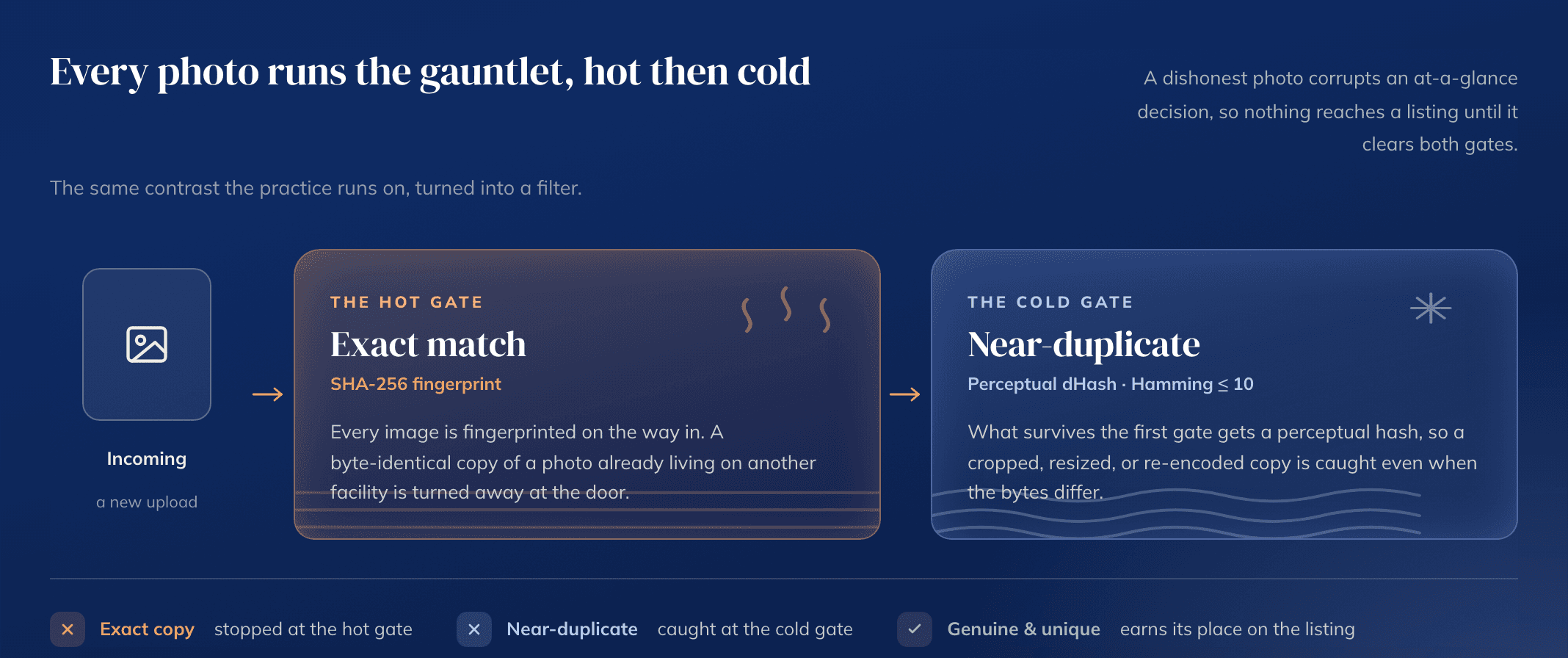
A directory is only as trustworthy as its worst listing. As facilities and photos arrived across every metro, generic and duplicated stock images started creeping in, quietly eroding the honest at-a-glance read the whole product depends on. So I ran a database-wide scan, saw the scale of it, and built a tiered cleanup to drive it out carefully, without deleting a single real photo.
That same care shaped the public rollout. Each metro launched as its own page, filtered, mapped, and curated, and only went live once its listings were clean.
Iterating in the wild
Launch was the midpoint, not the finish line.
A live product with real users behaves nothing like a prototype. Over a single month I ran close to thirty documented passes across layout, photography, data integrity, discoverability, and search. None of it was cosmetic churn. Every pass protected the same thing the research pointed at from the start: a clear, trustworthy decision, made at a glance.
The live product
276 facilities, live and growing.
A few screens from the shipped product.


The outcome
From prototype to a live product.
The work shipped as ThermAtlas. The visual language kept evolving past the prototype shown here, but the spine held: surface the criteria practitioners actually use, and let them decide with confidence.
Still live, still growing, still mine to tend.
Reflection
What I took away.
01
The project is never really done, and that's the point. Feedback from real users is what turns something usable into something genuinely good.
02
Designing for a tribe who care deeply about an activity is a gift. Their expertise hands you sharp, specific problem spaces to solve.
03
Chasing perfection slows you down. I did better by solving specific pain points and getting feedback early and often.
04
Building it myself made me a sharper designer. When you ship the thing, every decision has to survive real data, real security, and real users, not just a tidy prototype.
Want to build something kind?
Visit the live app →