Case study · Brand & web
Intuitive Acupuncture
A complete brand and website rebuild for a multi-clinician acupuncture and functional medicine practice on California's Central Coast.
Role
Brand, design, build, content
Client
Intuitive Acupuncture, SLO
Year
2026
Status
Live

The problem
A 13-year San Luis Obispo clinic had outgrown a single-template WordPress site: three clinicians, a dozen services, and a brand that read as spa rather than clinical care.
What I did
A new identity built on three words (Clinical, Layered, Cooperative), a five-page Framer site organised as a patient's questions in order, a three-tier services structure, on-location photography, and a handoff the team runs themselves.
What came of it
Live since June 2026, booking two taps from any page, and a team that updates copy and photos without a designer.
At a glance
A 13-year practice that had outgrown its website.
A San Luis Obispo acupuncture clinic came to Hue Kind with a dated, single-template WordPress site that no longer reflected what they'd become: three licensed clinicians, a layered clinical approach blending acupuncture with Motor Point Pathways and functional medicine, and patients who wanted clinical care, not spa marketing.
The new site is a five-page Framer build with a CMS-driven blog, a three-tier services architecture, a complete brand system, and a handoff bundle that lets the clinic publish and edit on their own.
The brief
Take the clinic seriously as clinical practice.
Jonathan, the owner, opened with a clear ask: a site that reads as evidence-based work by credentialed practitioners. No oversaturated stock photos of relaxation candles. No vague "wellness" copy. A patient should understand this is clinical care before they read a word about the methods.
And a clear constraint: the team had outgrown the old site. They'd added Kathy, a second acupuncturist focused on functional medicine and women's health, then Hana, a licensed massage therapist. Their services no longer fit a single column. The brand had to do two jobs at once: signal clinical seriousness, and stay warm enough that someone in pain felt safe booking a first visit.
Strategy before design
The site is the patient's questions, in order.
Before opening a design tool, I wrote the architecture as the questions a patient is actually asking when they arrive: what is this place, who works here, what would my first visit look like, what does it cost, how do I book. Each top-level page answers one of them.
That mapping set the navigation order, so "First Visit" is a top-level link rather than something buried inside an About page. The site surfaces what new patients need, in the order they usually need it.
Voice & language
Three words became the spine of the brand.
A practice this layered has a vocabulary problem. "Multi-modal" is accurate but jargon. "Holistic" means nothing specific. After several rounds with Jonathan and Kathy, the clinic landed on three words: Clinical, Layered, Cooperative. Clinical means evidence over platitudes. Layered means combining acupuncture, Motor Point Pathways, functional medicine, and bodywork as clinically appropriate. Cooperative means the patient is the expert on their own body, part of the plan rather than just the recipient of it.

A brand from scratch
A mark that layers, a palette that reads clinical.
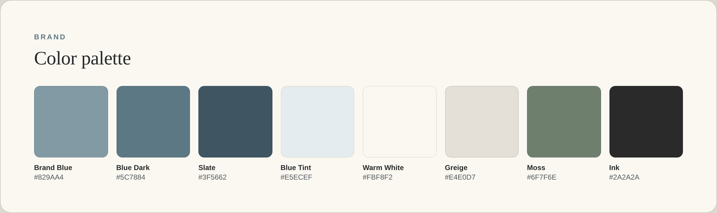
The old logo didn't carry forward. I designed a new identity around a stylized triangular mark, three planes that overlap and resolve into one form, echoing the layered-care concept. The wordmark is set in Source Serif to anchor the medical seriousness; body type is Inter for clinical clarity. The palette is built on a slate blue, paired with a warm white and a deep navy: professional on an invoice, quiet on a treatment-room poster.


The key process decision
Rather than design directly in Framer, I produced a static HTML mockup deployed to a live URL as the alignment artifact, six iterations, v1 through v6, with stakeholder feedback at each pass. Because it lived on a real link, stakeholders navigated it the way patients would. Feedback got specific: "this section feels off" while pointing at a real page, not a static frame.
It duplicated work that would later be rebuilt in Framer, and that cost was real. But by the time we moved to Framer, the design was already approved, so the build became mechanical execution instead of continued design negotiation.
Services as a taxonomy
A dozen services, honestly ranked.
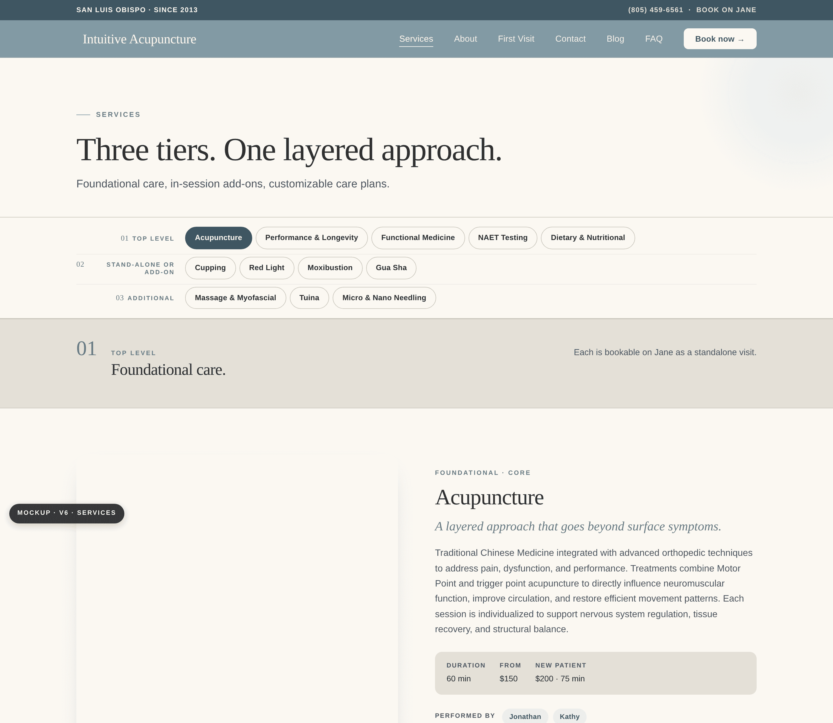
The clinic offers around a dozen services, but they don't all play the same role. A flat list would suggest that Cupping is a peer of full acupuncture treatment, which clinically it isn't. So I structured services as three tiers, presented openly, each tagged with the practitioner who performs it and a "Book with [name]" deep-link to their Jane schedule. That resolves the question patients otherwise have to puzzle out: who do I book with, for what.

The three-tier structure on the live Services page, with practitioner tagging and booking links.
The team, and real photography
Three clinicians, clearly.
Every photo on the site is real and made on location, the clinic team in their actual treatment room and by their dispensary shelf, not stock models. The practitioner grid gives each clinician a face, credentials, a specialty, and a direct booking link, so a patient can tell at a glance who does what.

Built for the team to run
No designer required.
The clinic has no in-house designer or developer, so the build had to be something they could maintain themselves. Four decisions made that true:
CMS-driven blog
Adding a post is filling out a form, not editing a layout. Blog thumbnails are auto-constrained to 16:9, which fixes the most common way non-designers break a site.
On-Page Editing
The team edits the live site in their browser, with no canvas, no layers, no design controls to break.
Scoped permissions
They get Content access without Design access, so they can update copy and photos but can't accidentally break the layout.
A real handoff bundle
Logos at every size and colorway, a style guide, and a how-to written specifically for non-designers.
Outcomes
Live, and easy to run.
The site went live at intuitive-acupuncture.com in June 2026. The navigation is genuinely friendly to a new patient. The services taxonomy resolves the multi-clinician question. The team is self-sufficient through On-Page Editing. And the brand holds up across contexts, triangle mark in a navbar, full lockup on a business card, wordmark in a footer, favicon at 16px, because it was built around a real vector system rather than a single PNG.

The responsive lockup: triangle mark and menu, clean at phone width.
Visit the live site →
What I learned
What I'm carrying forward.
01
Static mockup before Framer was the right call. It took the design negotiation out of the build phase, which made the build faster and far less stressful.
02
Spell out every contract milestone in plain language. A "when staging is approved" line meant two different things to me and the client. Future contracts name each milestone and its deliverable inline.
03
Photography is foundational, not finishing. The moment real photos replaced placeholders, the design tightened. On the next project, the shoot moves earlier.
04
Voice locked the rest of the brand. Once "Clinical · Layered · Cooperative" landed, every other decision, color, copy, typography, had a test to pass.