Case study · Brand identity
Ever Sky
A full brand identity for a vinyl listening lounge and bathhouse coming to Boulder, built to help people unplug and connect with reality again.
Role
Brand identity, logo & web
Client
Ever Sky, Boulder CO
Deliverables
Logo system, site, print
Status
Launching

The problem
A vinyl listening lounge and bathhouse opening in Boulder needed a brand with an edge, not the soft wellness look, and a web presence before the doors opened.
What I did
Brand identity from mood boards through two logo journeys, a launch landing page with waitlist sign-up, the full site ready for opening day, and the first print run.
What came of it
A mark that reads at any size, a live site collecting sign-ups, and founding memberships sold before opening.
The brief
Not your typical wellness space.
Ever Sky is a vinyl listening lounge first and a sauna and cold plunge second. The whole idea is analog: a place built to fight screen fatigue and help young Boulder professionals connect with reality, and with each other, again.
My client didn't want soft and clinical. They wanted something with an edge: mysterious, a little angsty, designed to turn expectations of a wellness brand on their head. Deliberately black and white, deliberately not the overplayed red-and-blue, and grounded in a few pieces of key imagery: butterflies, hands, and symmetry. Simple overall, with complex and delicate details.
Brand personality
A mysterious cool guy at a party.
The clearest brief I got was a character: someone in all black with nice boots and sunglasses, who turns out to be soft-spoken and kind the moment you talk to them. Relaxed, but cool. That single image guided every decision.
Discovery & mood-boarding
Finding the feeling first.
I ran a brand-vision questionnaire and consulting sessions to pin down the mission, the audience, and the feeling, then built mood boards to turn those abstract values into a direction we could both point at. Bold contrast, cool tones, photography-heavy, geometric and structured.

The first identity
From a real butterfly to a geometric emblem.
The first mark started literal and got braver with every round. I sketched twenty-two butterfly silhouettes, redrew the blue morpho as clean geometric planes, tucked a butterfly into the V of the wordmark, and pushed the wings through dozens of fill and outline studies before engineering it all into a bold, faceted emblem.

01 · Species ideation
Twenty-two butterfly silhouettes, sketched to find which wing shapes felt like Ever Sky.

02 · Species study
The blue morpho, redrawn as clean geometric planes.
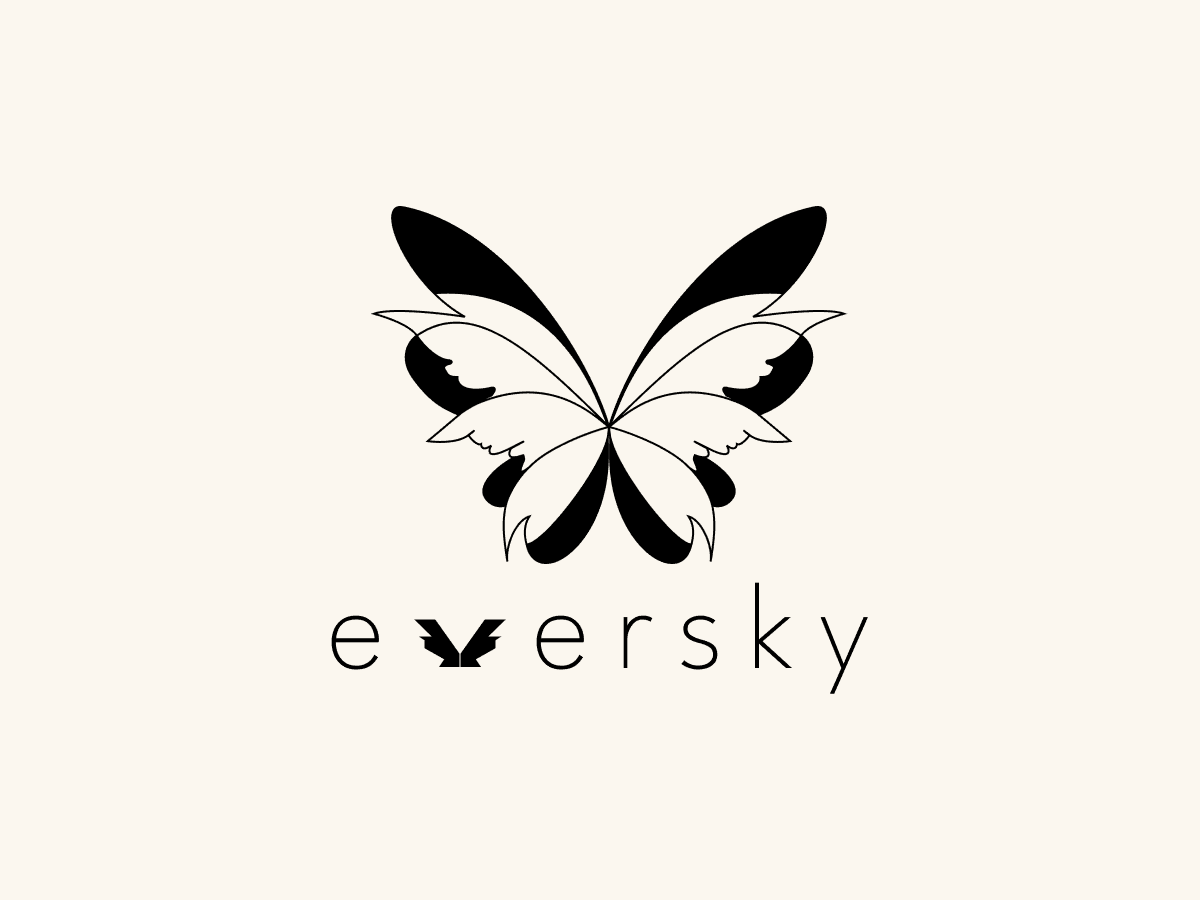
03 · The Butterfly-V
A butterfly tucked into the V of the wordmark. Ornate and detailed.

04 · Wing studies
Fills, outlines, and inner lines, tested round after round.

05 · Geometric studies
Faceting the wings into a structured, symmetrical lockup.

06 · The emblem
The first identity: bold, faceted, and a little hard.
In print
Good enough to print.
The first identity went all the way to print: business cards that put the geometric emblem in hand before anyone walked through the door. That is what made the next decision hard.


The turn
The geometric mark was good. It was already on business cards, and it would have been easy to call it done. Then Jamie, my client, named the thing I'd been circling: he wanted something simpler, a mark that still held up shrunk down to an app icon, a favicon, or a stamp on a towel. The intricate emblem looked great at poster size and fell apart small.
He was right, so I went back to the beginning and developed a second identity, reducing the whole thing to a single, gentle butterfly that reads at any size. It was not the comfortable choice, but it was the right one, and it is what we launched.
The second identity
The work is in the millimetres.
The second mark had to read at any size, so I reduced the butterfly to a single solid silhouette and let the refinement carry it: the proportion of the wings, how sharp the tips are, how close the mark sits to the wordmark. Every option went side by side until the lockup felt effortless.

01 · Three shapes
Round two put three versions of one silhouette side by side: medium, narrow-waisted, and fat and narrow. The client chose M2, the medium.

02 · Tip softness
Sharp, soft, and softer tips on the same wings. The sharp tips stayed.

03 · Wing spacing
How close the mark sits to the wordmark, tested in controlled steps.
The final identity
One brand, three forms.
The system flexes without losing itself. The full mark leads, the word mark carries the brand through tight spaces and repetition, and the butterfly alone becomes an icon, an avatar, a stamp. Same voice, different volume.


On the web
A landing page first, then the full site.
I designed and built Ever Sky's web presence in Framer, in two stages. The landing page went live first at eversky.club, holding the mood while the space is built out and collecting waitlist sign-ups for the client's email list.


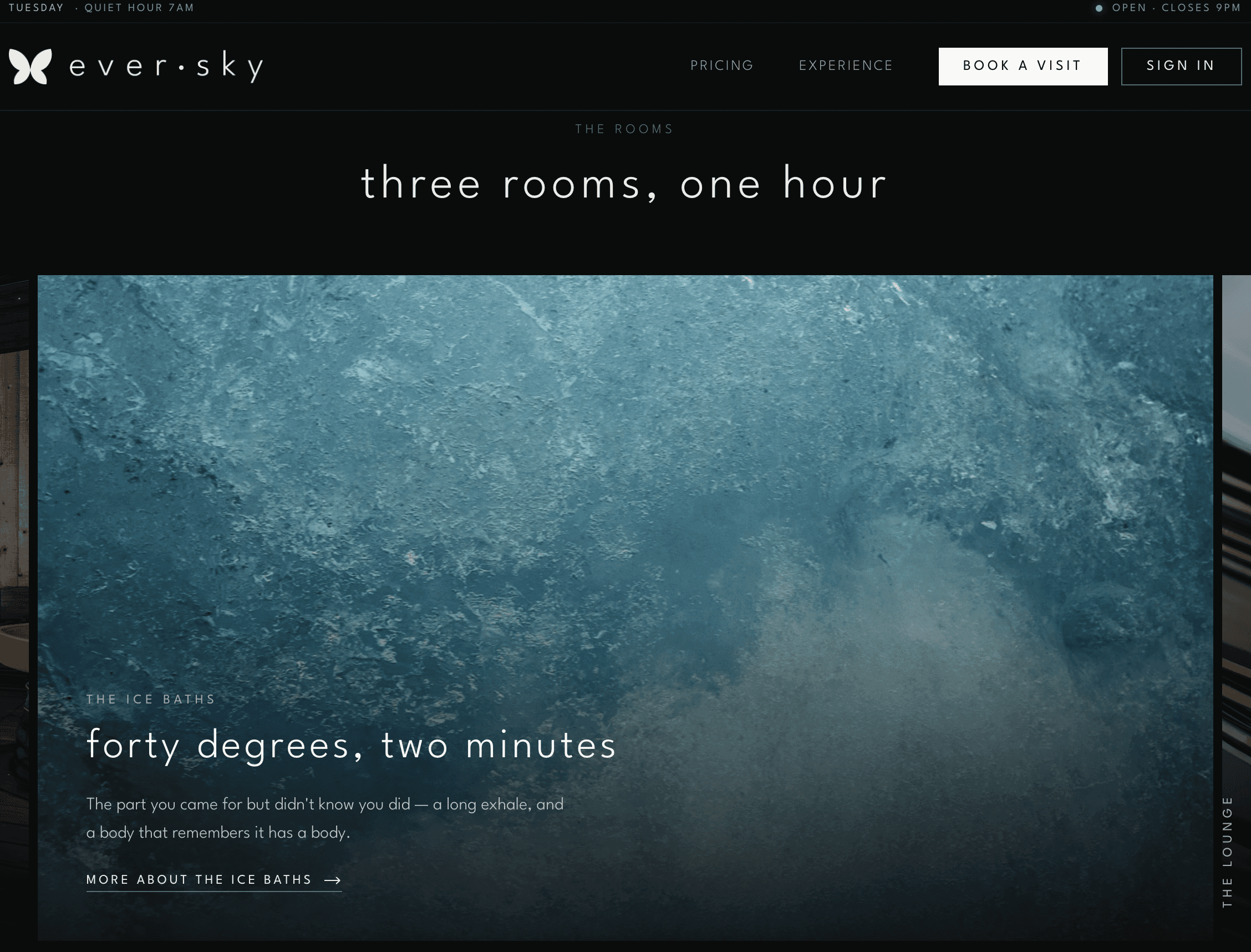
Live now at eversky.club: the waitlist landing page, on desktop and phone.
The full site, ready to launch
Behind the landing page, a fuller experience site is designed, built, and waiting for opening day, with the bathhouse story, pricing, and booking.


The outcome
A brand the client truly wanted.
Ever Sky is launching in Boulder with an identity that matches its character: calm, confident, and quietly mysterious. The work took a detour through a second logo, but the detour is the point. The client got a brand they love, and I got one I'm proud to put my name on.
In Jamie's words
Working with Colin at Hue Kind Design was an amazing experience. He is both professional and personable, and I always felt comfortable bringing him new (and sometimes really out there) ideas throughout the process. He took the time to understand my vision and brought everything together wonderfully.
Colin consistently went above and beyond, delivering both my website and brand identity in an incredibly timely manner without ever sacrificing quality. Communication was always on point, and I couldn't be happier with how everything turned out, and I'm so grateful for the care and thought he put into bringing my brand to life!
Reflection
What I took away.
01
The bravest design move is often subtraction. Reducing the mark to a single butterfly took more conviction than adding detail ever did.
02
Falling in love with a finished solution is a trap. Being willing to start over is a skill, not a failure, and the client felt the difference.
03
A clear character beats a list of adjectives. "A cool guy in all black who's secretly kind" decided more than any brand keyword could.
04
Designing and building the site myself meant the brand reached the world exactly as intended, with nothing lost in handoff.
Want a brand worth starting over for?
Visit eversky.club →